First, off, thank you, everybody, for your suggestions. I really appreciated
them. :)
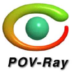
Here's the latest version of the logo. I tried everybody's ideas, but only
got around to implementing the following changes:
a) Color-sheme
b) Slight changes in sizes
c) Slight change in rotation of the ellipse, to better mimic a real eye.
Once again, thank you everybody for the suggestions leading to the current
stage of the image.
I'm also providing a black and white version of it, so you can get a gander
at that, and I also added the text "POV-Ray" so you can see what it looks
like with it. It isn't actually part of the logo. It's only there to show
that the logo doesn't need it, it's simply a redundant complement to those
who know it, and it tells first-timers to what program it belongs.
Post a reply to this message
Attachments:
Download 'eye128.gif' (7 KB)
Download 'eye32.gif' (2 KB)
Download 'eyegs.gif' (2 KB)
Preview of image 'eye128.gif'
Preview of image 'eye32.gif'

Preview of image 'eyegs.gif'

|